Photoshop- Intro
We started out by using the Quick Selection tool to cut out the green man from his background. Afterwards, we moved him to a new document. Next we used the shortcut command J to duplicate the green man 13 times and made them all smaller as well as lined up. With the original, we kept it large and then using the layer effects added a black, thick stroke and also added a bright, red colour overlay. Then, we used the shortcut command delete to fill in the background with the colour yellow. Finally, we added the text, "Hey Girl, I'm Just Hangin ;)", adjusted the size, etc. and using the layer effects, added two strokes (pink and purple), a drop shadow (with low opacity), and a pattern overlay.
Photoshop- Man
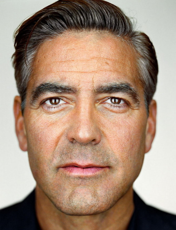
Original
Real Edit
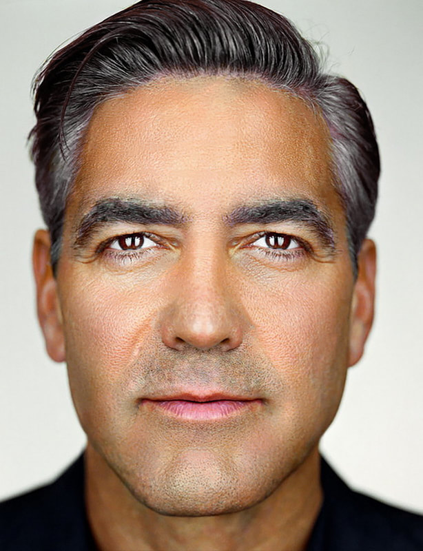
First, using the Marquee tool, we made his face symmetrical. We decided on the better eye, side of the nose, and side of the mouth. Then we duplicated each of them onto their own separate layer and moved them (flipped) to the other side of the face. To make it smooth and seamless, we used the eraser tool (with a feathered, soft eraser) and removed any harsh lines surrounding the duplicated eye, half nose, and half mouth. After that, we used the spot healing brush and removed any blemishes, misplaced eyebrow hairs, and harsh wrinkles. We did not get rid of all wrinkles/creases because we did not want to make him too doll like. Next, we created a new layer and used the hue/saturation image adjustments and made it purple, added a layer mask, and made sure only his hair was revealed through the mask to make only his hair purple. We repeated the same process but for the eyes and using the colour brown instead of purple. Later, we used the liquify tool to somewhat define his jawline and cheekbones as well as bring down his nose (make his nose longer). Finally, we minimized his pores using high pass and gaussian, then adding a layer mask, and making sure the only parts of the edited image on this layer was the skin I wanted to smooth.
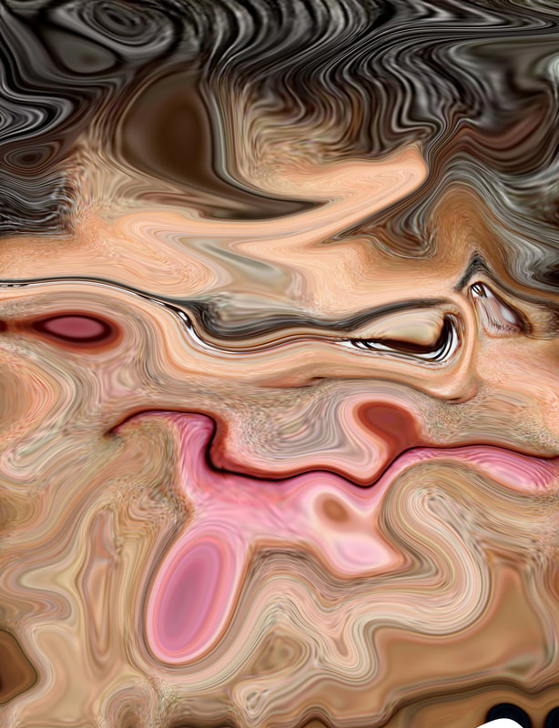
Joke Edit
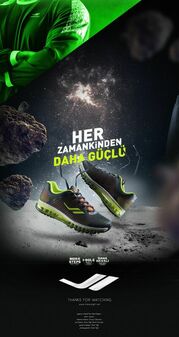
Photoshop- Shoe Ad
Original Image |
Shoe Ad- Mine |
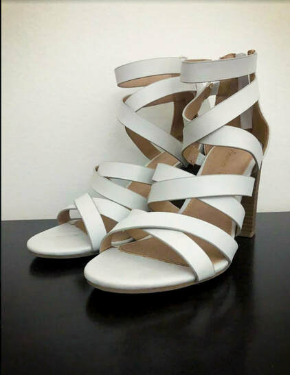
I started out by cutting out the shoe from the original image using the quick selection tool. Then I moved the image onto a new, 8" by 11" document.
I made the background black because I was inspired by the Nike Air "Have You Hugged Your Foot Today?" ad to go for a neutral theme that had small pops of colour. Then I used the brush tool (using a hard, small, and round brush) and drew stars around the shoe. After that, I used the brush tool again (soft, feathered, big brush) and put it in the corner of the image and then feathered it around the shoe to make the shoes look like they are creating a glow of some sorts. Then, with a space brush set downloaded from brusheezy and put it behind the shoe to add the lines. I also used another brush from the set to add the circle, reflection thing. Next, I used the layer effects tool to add a drop shadow, and a grey satin to the shoe. Later, I added the text and made sure it was white so it would stand out and then put a purple stroke to the text like the pop of purple in the Nike Air "Have You Hugged Your Foot Today?" ad. Finally, I added the Payless logo to the bottom of the ad to be the last pop of colour as well as say where the shoes are from.
I made the background black because I was inspired by the Nike Air "Have You Hugged Your Foot Today?" ad to go for a neutral theme that had small pops of colour. Then I used the brush tool (using a hard, small, and round brush) and drew stars around the shoe. After that, I used the brush tool again (soft, feathered, big brush) and put it in the corner of the image and then feathered it around the shoe to make the shoes look like they are creating a glow of some sorts. Then, with a space brush set downloaded from brusheezy and put it behind the shoe to add the lines. I also used another brush from the set to add the circle, reflection thing. Next, I used the layer effects tool to add a drop shadow, and a grey satin to the shoe. Later, I added the text and made sure it was white so it would stand out and then put a purple stroke to the text like the pop of purple in the Nike Air "Have You Hugged Your Foot Today?" ad. Finally, I added the Payless logo to the bottom of the ad to be the last pop of colour as well as say where the shoes are from.
Shoe Ad- Inspiration
|
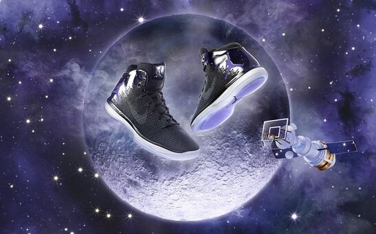
These ads were my inspirations. I really liked the idea of a space theme and after seeing these ads I thought of the "out of this world" and knew I had to go with the space theme. I liked the stars and moons as well as darkness around a light source.
|
|
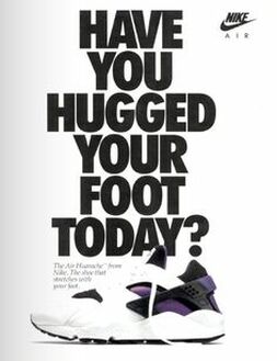
I also really liked this ad. I appreciated how it was very black and white (neutral) and had a pop of purple. I used it as inspiration by making the majority of my ad using neutral colours/tones and then adding the pops of colour (purple stroke around text and orange logo).
|
Poster- Of Lea
Editing:
I started out by opening the image and using the quick selection tool to remove the background behind Lea. Afterwards, I moved her to a separate document and began my poster. I placed the picture of in the bottom right corner. With a splatter brush I downloaded earlier, I created a new layer under the lea layer and added some splatter behind her. After that, I added the text that said her name at the top left corner of the picture. On that text, I added the layer effects, stroke in the colour red, a white colour overlay, a red, feathered outer glow, and a drop shadow. Once I finished the text, I made a new layer and added the black border around her using a design fabric brush set that allowed my brush to be square and create perfectly straight lines. Next, I duplicated the Lea layer and added some layer effects to the picture of Lea such as, slight red-orange stroke, inner glow, red colour overlay, and a feathered drop shadow. I placed this layer under the duplicated Lea which has no layer effects yet. Now, I added layer effects to the top, visible Lea layer. The layer effects were, the same stroke, light grey satin, outer glow, and drop shadow.
Later, I added images I found online of things she liked, such as a pumpkin, and a Minecraft sword. I also added the picture I took of one of the pages in her sketch book. I put all these images into the bottom left corner of the image, on top of all the previous layers I created. I also found images of the pink, double heart emoji, duplicated it, and surrounded her with a few of them. Next, I created a new layer and traced her eyes, nose, and mouth using the normal brush tool in the same red I used for the stroke on the text. I also made new layers and repeated this step for the sketchbook, Minecraft sword, and pumpkin. I positioned all of these doodles around her and then using a new space brush set, surrounded her with different space related things and made the colours either red, black, or pink.
Why I did certain things:
I wanted to make the image of Lea gloomier as I feel like it more suits her aesthetic and personality. Even though I made her gloomier, the rest of the poster itself is meant to be more colourful. This is because as she does go for a gloomy, dark aesthetic, she also likes many colourful things. I chose a doodly font as Lea is very passionate when it comes to her art and doodles a lot. That is also why I traced over her face, the Minecraft sword, the pumpkin, and added her sketchbook. I used a space brush set because Lea is interested in it and watches many videos on the universe and space. I added the Minecraft sword because Minecraft was a big part of her childhood as it was for many other kids, and we often reference it as a joke. The reason for the pumpkin is to represent Lea's fascination for spooky things as well as her love for Halloween. I used the colours red, black, and pink because the pink complimented the emoji's, the red and black are her favourite colours. Lastly, I took inspiration from "niche memes" for this poster, especially the background, because they are kind of an inside joke between us.
