Lea
*Disclaimer*
When taking these photos I did not pay too much attention to their backgrounds as I was planning to use them for my poster and therefore planning to cut out the backgrounds.
When taking these photos I did not pay too much attention to their backgrounds as I was planning to use them for my poster and therefore planning to cut out the backgrounds.
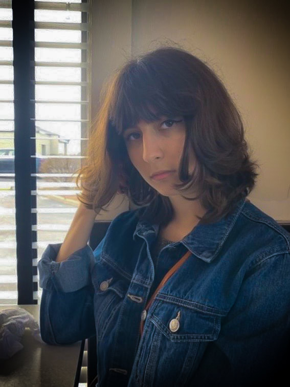
I wanted this picture to be weighted centre to the right side. I made sure the lines in the background were straight and leading to her.
When editing, I started out by adjusting the white balance. Then I brought up the contrast (+27), and vibrance (+37). After that I brought down the exposure (-0.60), highlights (-37), shadows (-6), whites (-23), blacks (-10), and clarity (-21). Next, I brought up the sharpness (44). Finally, I did the Post-Crop Vignetting by bringing down the amount to (-87), increasing the midpoint (+80), roundness (+100), feather (92), and highlights (100). |
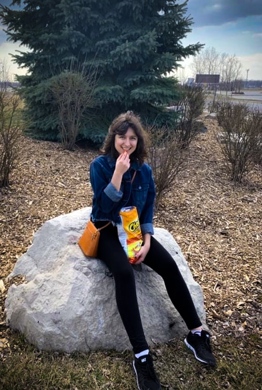
I wanted this picture to be centre to bottom weighed. I also wanted Lea to be sitting on a rock and bending her legs to make her appear taller.
When editing, I started out by adjusting the white balance. Afterwards, I brought up the contrast (+9), highlights (+51), whites (+46), blacks (+48), clarity (+12), vibrance (+47), and saturation (+8). Then, I brought down the exposure (-0,45), and shadows (-48). Finally, I brought down the amount of Post-Crop Vignetting (-44), and I brought up the Post-Crop Vignetting midpoint (67), roundness (+45), and feather (77). |
I started out by positioning the book so that it looks like it would be standing when cut out from the background. I also wanted there to be that funky lights and shadows on the page.
When editing, I started out by cropping the image so it would be centre weighed since there was a lot of extra space below the book. Then I adjusted the white balance. After that, I brought up the highlights (+89), vibrance (+18), and saturation (+22). Finally, I decreased the exposure (-1.25), contrast (-20), shadows (-8), whites (-94), blacks (-37), and clarity (-7). |
Shoes
*Disclaimer*
When taking these photos I did not pay too much attention to their backgrounds as I was planning to use them for my shoe ad and therefore planning to cut out the backgrounds.
When taking these photos I did not pay too much attention to their backgrounds as I was planning to use them for my shoe ad and therefore planning to cut out the backgrounds.
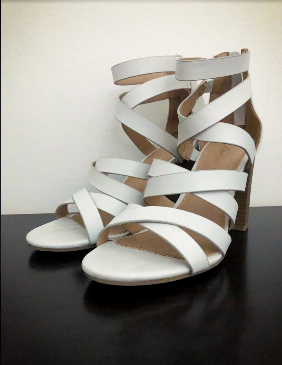
I started out by white balancing this picture. Next I brought up the exposure (+0.35), contrast (+7), highlights (+26), clarity (+7), and vibrance (+41). I also brought down the blacks (-36) and saturation (-1).
Then, I brought down the amount of post-crop vignette (-29), feather (63), roundness (+42), and highlights (48). Finally, I used the spot removal tool just to make sure there was no dirt or discolouration on the shoe. |
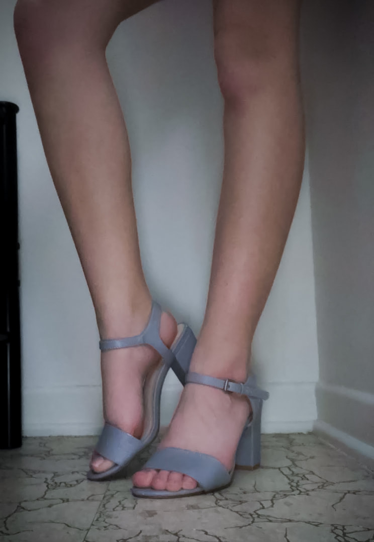
I wasn't exactly sure what aesthetic I wanted to go for with this ad but I was originally considering a "grungier" feel and that is why this image is darker.
I started out by white balancing this image. Next, brought up the exposure (+0.70), highlights (+51), vibrance (+37), and saturation (+5). I also brought down the contrast (-10), shadows (-76), whites (-39), blacks (-30), and clarity (-7). Finally, I brought down the Post-Crop Vignetting amount (-39) and brought up the feather (84), roundness (+60), and highlights (44). |
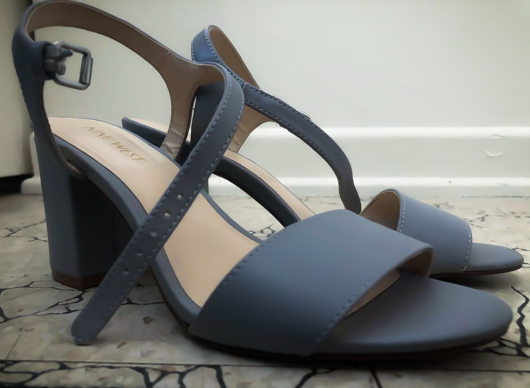
I started out by white balancing this image. I brought down the exposure (-0.25), whites (-15), blacks (-19), and clarity (-8). I also brought up the contrast (+48), highlights (+39), shadows (+5), and vibrance(+1).
Then I brought up the sharpness (14), radius (2.1), and luminance (100). After that I brought down the post-crop vignetting (-30) and made it really feathered. Finally, I used the spot removal tool to get rid of any dirt on the shoes. |
Glasses and Bottles
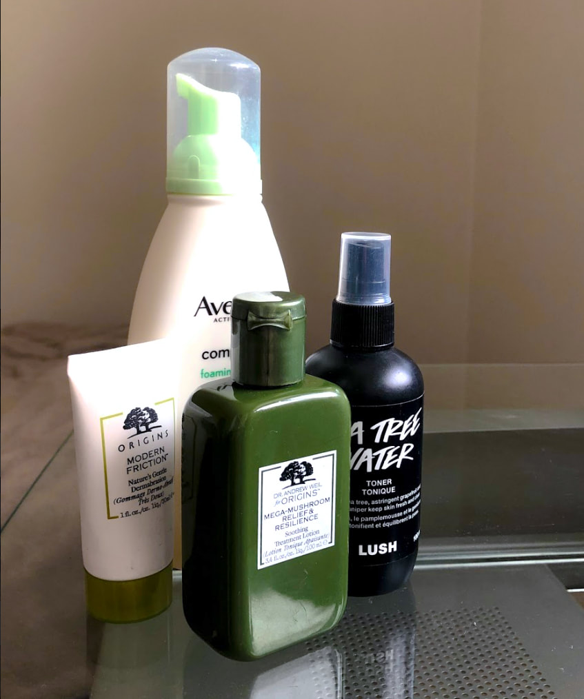
Since the theme didn't specify what type of bottles, I decided to take pictures of some skincare bottles I have to spice things up. I wanted this image to not be centre weighted but instead leaning more towards the left. I took this picture on my desk and used to lines of the desk as leading lines guiding the viewer to the bottles. I also wanted none of the colours to clash so all the bottles are either neutral colours (black and white) or green. To make the picture a little more interesting, I face the bottles away from the viewer and towards the light source so there is a contrast between light and dark and to not appear boring.
In Lightroom, I as per usual started out by adjusting the white balance. Then I brought down the exposure (-0.70), contrast (-58), whites (-14), and clarity (-7). I also brought up the highlights (+58), shadows (+9), blacks (+7), vibrance (+56), and saturation (+4). Finally, I went in with the spot removal tool to get rid of any dust that might've been on the table. |
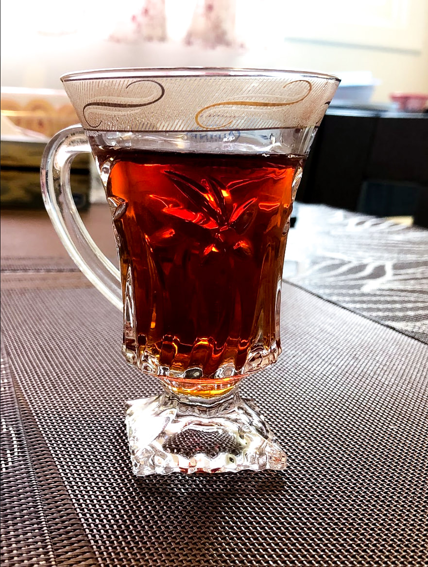
Honestly, looking back at this photo, I am not very proud. I started out by deciding the photo should be centre weighted and have radial balance. The textured lines on the place mats lead from the back of the photo to the front, bringing attention to the cup of tea.
In Lightroom I started out by adjusting the white balance. Then I brought up the exposure (+0.45), brought down the contrast (-6), increased the highlights (+57) and whites (+53), and decreased the shadows (-19) and blacks (-28). After that, I brought up the clarity (+9), brought up the vibrance (+12), and decreased the saturation (-2). Finally, I increased the texture in the glass and place mats, by bringing up the sharpness (32), radius (1), and detail (14). |
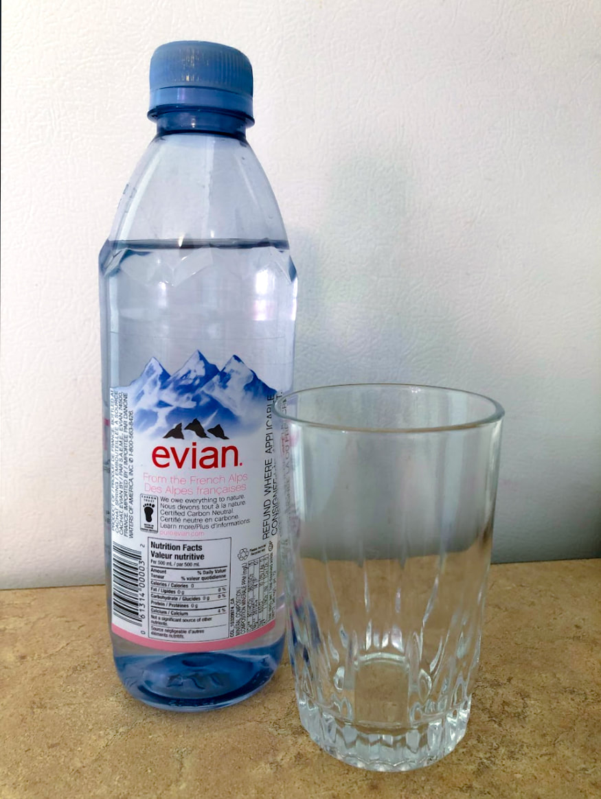
I decided to make this image centre weighted. I also wanted it to have both symmetrical and radial balance. I even made sure the water bottle was to be on a yellower platform as the colours are complementary colours.
In Lightroom, I started out with adjusting the white balance. After that, I simply went in with the spot removal tool and got rid of any dirt that was in the background (which is a fridge). Then I brought up the exposure (+0.35), highlights (+29), and whites (+21). I also brought down the contrast (-40), shadows (-39), blacks (-33), and clarity (-12). Finally, I increased the vibrance (+51) and saturation (+5) because I wanted the blue and yellow in the picture to be more vibrant and eye catching as they are complementary colours. Also, the yellow of the platform was kind of dull before doing this. |
Patterns
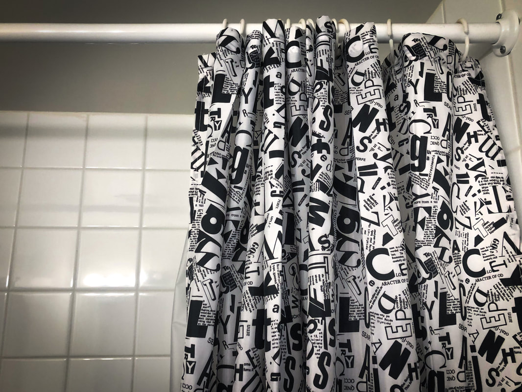
I took this picture so that it was weighed more on the right side and therefore have an asymmetrical balance. I simply wanted to do something different compared to the other two photos. I also used the horizontal lines in the wall and the shower curtain rod as leading lines directing you to the centrepiece (the black and white patterned curtain.) I decided to go for a neutral-black and white theme for this image so the colours all compliment each other and they are simple.
In Lightroom, I started out by adjusting the white balance and cropping it. Afterwards, I brought down the exposure (-0.75), and brought up the contrast (+28), whites (+47), highlights (+59) and shadows (+48). Then I just brought down the vignette and made sure it was feathered and rounded enough so that it would look seamless and smooth. |
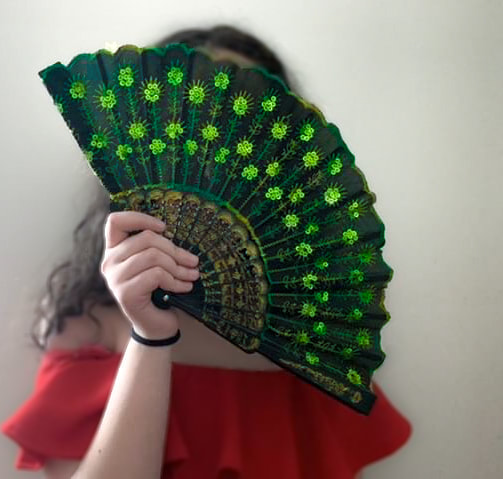
For this picture I decided to use a model as I found that working with other people was fun. I wanted this image to be mostly center weighted but slightly weighted to the left. In class we learned that people are attracted to other peoples faces, I decided to use that to my advantage. I made sure that the models face was covered by the fan which had the pattern on it. Therefore, when the eye looks for the face it is directed straight to the centrepiece. I even used her arm as a leading line so when your eye goes up her it leads you to the fan. I also put the model in a red dress since the colours red and green are complementary colours and the colour of the pattern on the fan is primarily green. This image can be considered in my opinion either one with symmetrical balance or radial balance. That is because everything in the image is centred around the fan but both sides of the image are fairly symmetrical.
In Lightroom, I started out my adjusting the white balance of the image. Then, I used to Adjustment brush tool and selected the background of the image (basically everything but the fan and her arm holding the fan). I brought up the clarity and decreased the sharpness to make the background blurrier to keep it from taking attention away from the fan and it's pattern. Afterwards, for the entire image I decreased the contrast (-13), brought up the highlights (87), increased the whites (+71), decreased the blacks (-7), decreased the clarity (-5), and finally decreased the vibrance (-5). To finish, I finally adjusted the vignette by bringing it down but making it very feathered and rounded so it would be very gradual, soft, and unnoticeable. |
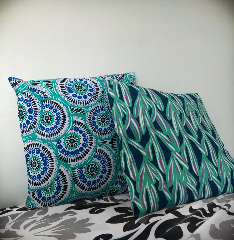
I also took this picture when I was at my friend's house. I saw that there were patterns on the pillows and her bed covers which I decided to take advantage of. I made this photo a bottom weighed photo so that there would be a low angle point of view. I decided that since the pillows were cool-toned colours and the bedding had neutral colours, the white background would compliment them without taking away attention from the centrepiece, the pillows. I also decided to make this image symmetrical as it would be more simple which is the vibe I tend to go for.
In Lightroom, I started out by cropping the image and then adjusting the white balance. Afterwards, I brought up the clarity (+4) to smooth out the image slightly. Then I brought up the vibrance (+9) and Saturation (+18) so the colours in the pillows would be more vibrant and stand out more. When I finished that, I brought up the sharpness, detail, and radius. Finally, I darkened the corners by bringing down the vignette, then increasing its roundness and feather so it would not be too harsh. |
Circles and Ovals
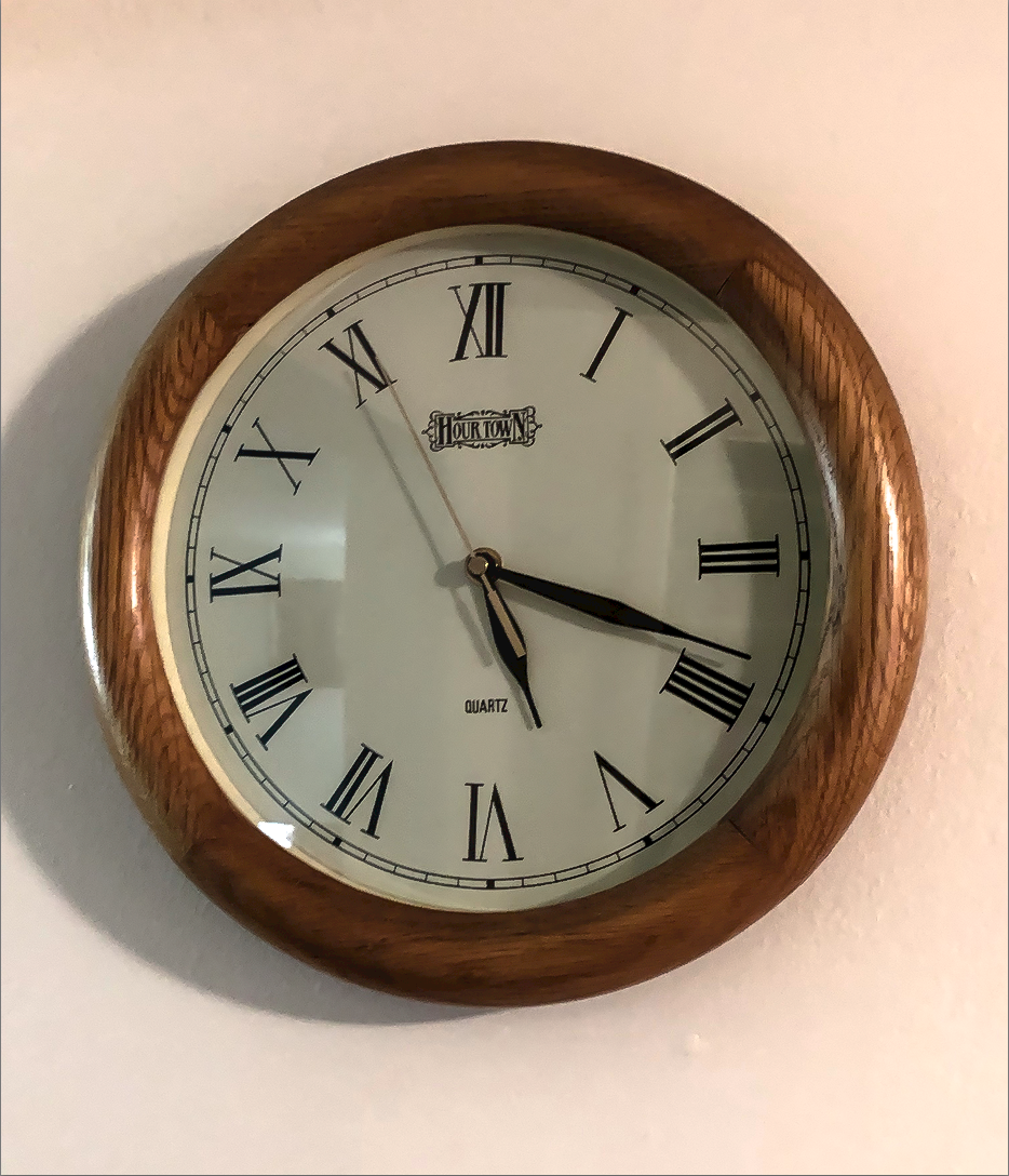
I chose to take this photo in this position because I wanted to make sure there was a balance of negative space and positive space. Since there was not much else around the clock, I decided to make this a centre weighted image so the negative space would be balanced and equally distributed around the clock. The image being centre weighted was a decision I made also because I wanted this image to have symmetrical balance.
The background is just a white wall to not distract from the clock. I started out in Lightroom by adjusting the white balance. Since I know that the colours in an image cannot clash, I decided that since the wall and inside of the clock were white, I would bring up the contrast of the image to darken the border of the clock and properly separate the clock from the wall. By there being more colour there, it would catch your eye easier as it is the focal point of the image. I brought up the sharpness so you could see the texture on the border of the clock and I brought up the clarity so the rest of the image would appear to be smoother.. |
Using the 9 zone grid, I made this image left to centre weighted. The image is also leaning toward centre to top weighted. Since this is how I decided to weigh my image, I made sure that there was negative space on the right side and bottom of the image. The image itself was fairly white balanced, I just had to make it a bit bluer in temperature. In this image, I decided to go for a black and white theme. I noticed that before I edited the image, the blacks and whites did not stand out as much so I adjusted the contrast and highlights as well as the whites and blacks.There was also some dust on the table which I got rid of using the spot removal tool.
|
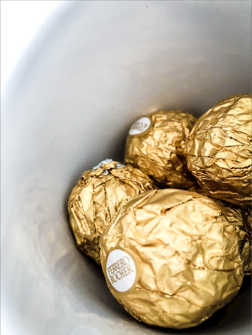
Using the 9 zone grid, I made this image right and bottom weighed. This resulted in negative space on the top and left. I really liked the yellow in the chocolates wrapping and decided it might be an interesting design choice if I put it in a cup and took a picture of the inside of the cup. I tried to use the angle of the inside of the cup to bring attention to the chocolates, as if there were invisible lines bringing your eye towards the chocolate. When I began editing, I began by adjusting the white balance which ended up dulling out the yellow in the chocolate. To return the yellow, I adjusted the contrast, and yellow and orange hue. I began to bring up the sharpness so the wrinkles in the wrapping of the chocolate would stand out more. To make the chocolate stand out even more, I brought up the clarity so that the background was smoother and the wrinkled in the chocolates wrapping stood out even more, grabbing the viewers attention.
|
